Survey Analysis
An airline has conducted a comprehensive passenger satisfaction survey. The goal is to identify customer needs and pain points, and to share insights through clear, easy-to-understand visualizations—ultimately improving business performance. As an analyst, your task is to create a report that supports data-driven decision-making.
Survey analysis has become an essential skill for all business professionals—not just data scientists. In this tutorial, we move beyond superficial analysis that simply counts the number of complaints, aiming instead for deeper, actionable insights.
Specifically, we will focus on three key analytical perspectives:
-
How are dissatisfaction items related? (Factor Analysis)
Often, customer complaints are just the tip of the iceberg, signaling deeper, fundamental issues within the company. Management aims to identify these root causes for comprehensive solutions. Therefore, the analyst's role is not merely to count complaints, but to get as close as possible to the true underlying issues. Factor Analysis is one approach to finding these root causes. This method quantifies the intuitive insight that if certain issues have a high probability of occurring together (correlation), they likely stem from a common underlying factor. For example,Check-in service,On-board service, andInflight service—these may all stem from a common root cause (e.g., Service Quality). -
Which factors impact overall satisfaction the most? (Sensitivity Analysis)
Some issues are severe enough to prevent customers from ever flying with you again, while others are tolerable. Which problems should be prioritized? You need to identify the critical drivers of satisfaction (or dissatisfaction) to allocate resources effectively. -
What pain points are unique to specific segments vs. shared across all? (Correspondence Analysis)
Even if a segment is small, it cannot be ignored if it represents high-LTV (Lifetime Value) customers, such as loyal business travelers. What unique frustrations do they face? Identifying these distinct patterns is crucial for targeted strategy and decision-making.
These three perspectives are difficult to obtain through simple aggregation alone, but they are vital for strategic planning. Now, let’s analyze the data with Allye.
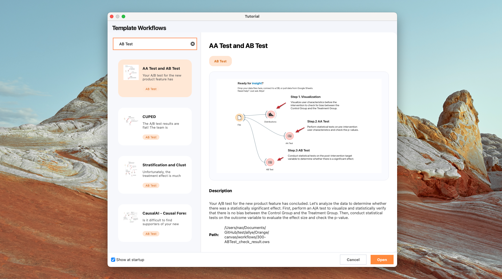
Note: You can find following workflow files in Template Workflows
Data
This guide walks through a practical survey analysis workflow in Allye using the Airline Passenger Satisfaction dataset. You can also download the CSV file from here.
Below is a summary of the key variables:
| Column Name | Description | Example Values |
|---|---|---|
| Gender | Gender of the passenger | Female, Male |
| Customer Type | Loyalty status of the customer | Loyal customer, disloyal customer |
| Age | Actual age of the passenger | 21, 35, 52 |
| Type of Travel | Purpose of the flight | Personal Travel, Business Travel |
| Class | Travel class chosen by the passenger | Business, Eco, Eco Plus |
| Flight distance | Flight distance of the journey | 67, 1200 |
| Inflight wifi service | Satisfaction level: Inflight wifi service (0: N/A; 1-5) | 0, 1, 2, 3, 4, 5 |
| Departure/Arrival time convenient | Satisfaction level: Departure/Arrival time convenience | 1, 2, 3, 4, 5 |
| Ease of Online booking | Satisfaction level: Online booking experience | 1, 2, 3, 4, 5 |
| Gate location | Satisfaction level: Gate location | 1, 2, 3, 4, 5 |
| Food and drink | Satisfaction level: Food and drink | 1, 2, 3, 4, 5 |
| Online boarding | Satisfaction level: Online boarding experience | 1, 2, 3, 4, 5 |
| Seat comfort | Satisfaction level: Seat comfort | 1, 2, 3, 4, 5 |
| Inflight entertainment | Satisfaction level: Inflight entertainment | 1, 2, 3, 4, 5 |
| On-board service | Satisfaction level: On-board service | 1, 2, 3, 4, 5 |
| Leg room service | Satisfaction level: Leg room service | 1, 2, 3, 4, 5 |
| Baggage handling | Satisfaction level: Baggage handling | 1, 2, 3, 4, 5 |
| Check-in service | Satisfaction level: Check-in service | 1, 2, 3, 4, 5 |
| Inflight service | Satisfaction level: Inflight service | 1, 2, 3, 4, 5 |
| Cleanliness | Satisfaction level: Cleanliness | 1, 2, 3, 4, 5 |
| Departure Delay in Minutes | Minutes delayed at departure | 0, 15 |
| Arrival Delay in Minutes | Minutes delayed at arrival | 0, 20 |
| Satisfaction | Overall satisfaction level | Satisfaction, neutral or dissatisfaction |
1. Understand the overall structure
Before diving into details, let's grasp the current situation. We need to answer fundamental questions: "Is the overall satisfaction high or low?" and "Which services are performing poorly on average?"
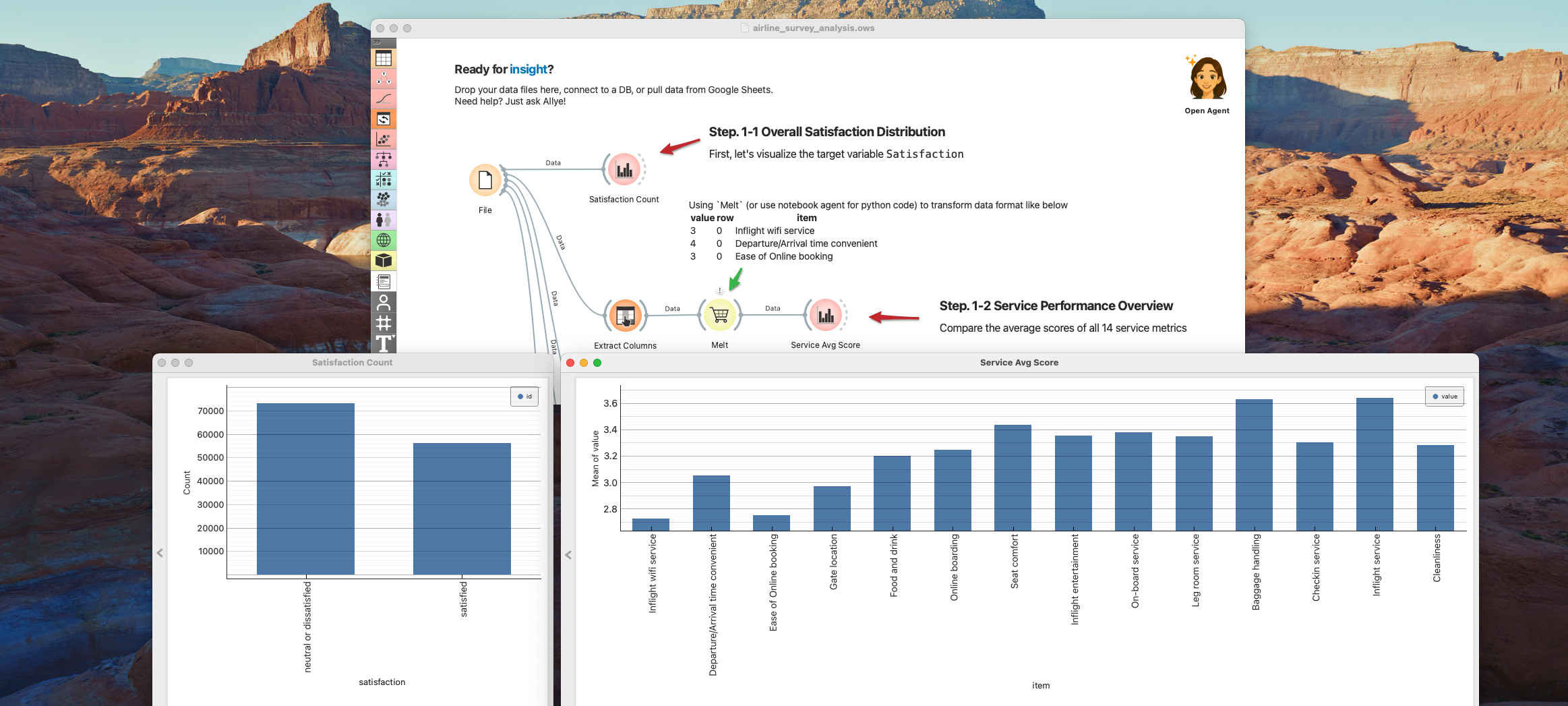
1-1. Overall Satisfaction Distribution
First, let's visualize the target variable Satisfaction.
- Use
Bar Plotto show theSatisfaction Count
- Observation: As seen in the chart, nearly 60% of customers are "neutral or dissatisfied." This indicates a significant opportunity for improvement.
1-2. Service Performance Overview
Next, let's compare the average scores of all 14 service metrics (e.g., Wifi, Food, Seat comfort) to identify obvious weaknesses.
- Extract survey columns by applying
Select Columnswidget and useMeltto transform table structure.
- Observation: While
Inflight serviceandBaggage handlingshow high scores,Inflight wifi serviceandEase of online bookingare rated poorly across the board. These low-scoring items are potential "pain points" to investigate further.
2. Identify the Dissatisfaction Factor
Let's identify the factors that are significantly damaging overall satisfaction. First, since Business Class and Economy Class customers have fundamentally different user experiences and receive different services, it is appropriate to conduct Dissatisfaction Factor Analysis separately for each group.
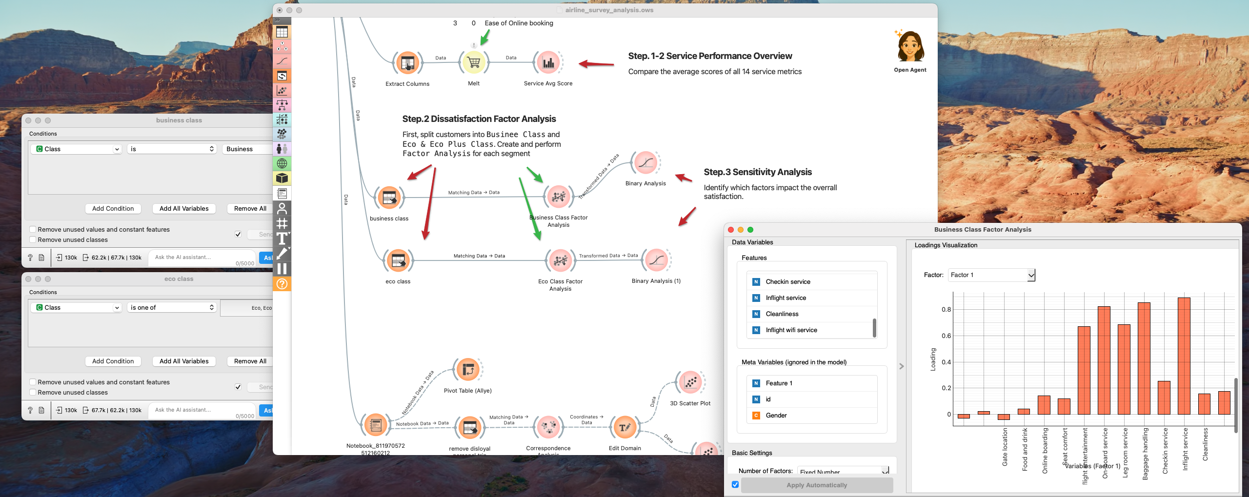
2-1. Dissatisfaction Factor Analysis
If there is a strong correlation between Complaint A and Complaint B (meaning these two complaints tend to occur simultaneously), it is suspected that a common "root cause (latent factor)" exists behind them. Factor Analysis is a technique that unravels the correlations among many variables to extract hidden "factors (groups of causes)." Let's try it out.
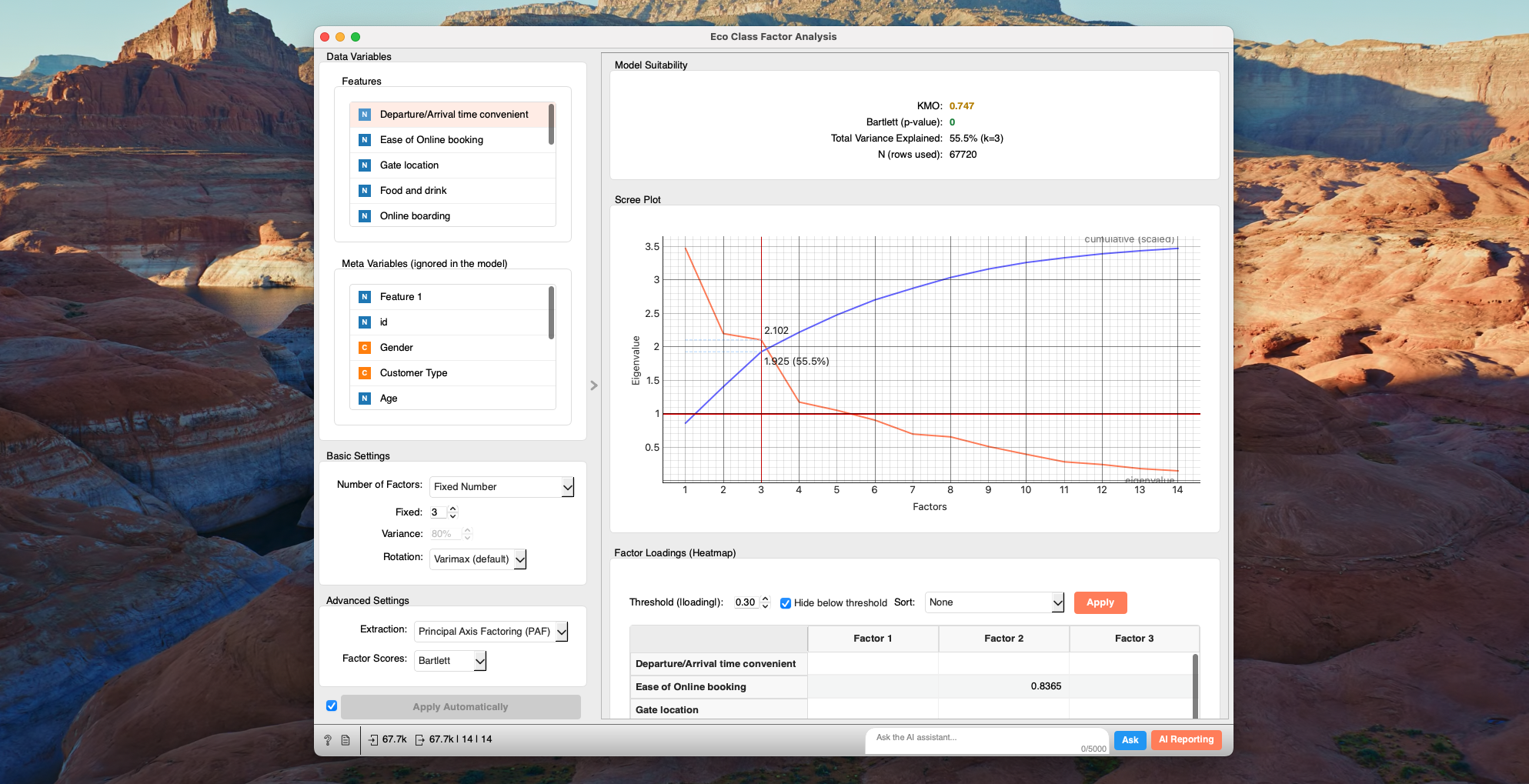
- Connect to the
Factor Analysiswidget and select the 14 Survey Items as Features. - For
Number of Factors, selectFixed Numberand setFixed: 3. Leave other settings as default.
It will run automatically, and the report will be displayed in the main area.
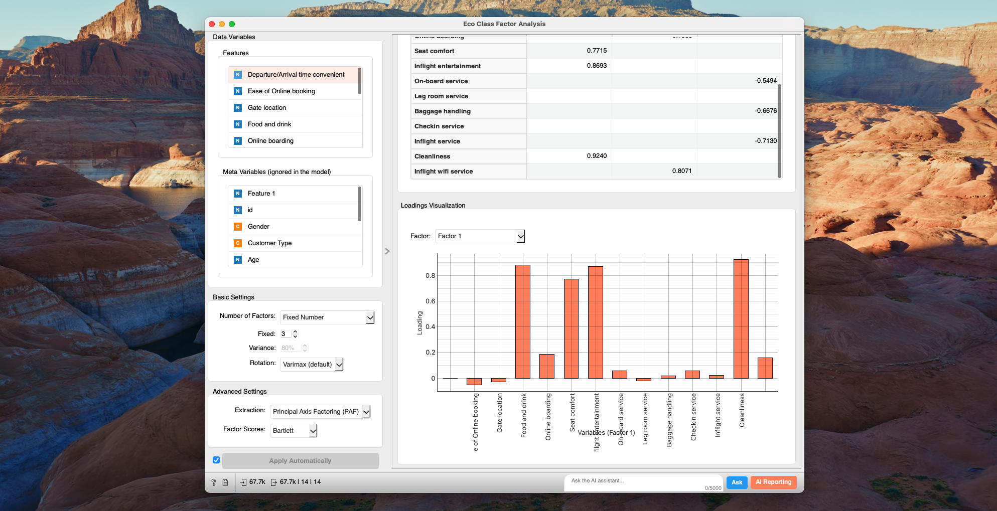
Focus mainly on two things:
Scree Plot: The vertical axis represents the "Eigenvalue," which indicates how much of the variation (spread) in the original data the factor explains. A higher value means the factor captures a "major structure" behind the data.Loading Visualization: This graph helps interpret "what exactly does each factor represent?" and name them.
- Check which item's bar extends the furthest for each factor (Factor 1, Factor 2...). A longer bar (higher value) means a stronger connection to that item.
- For example,
Factor 1is associated withFood and Drink,Seat Comfort,Inflight Entertainment, andCleanliness.
Observations
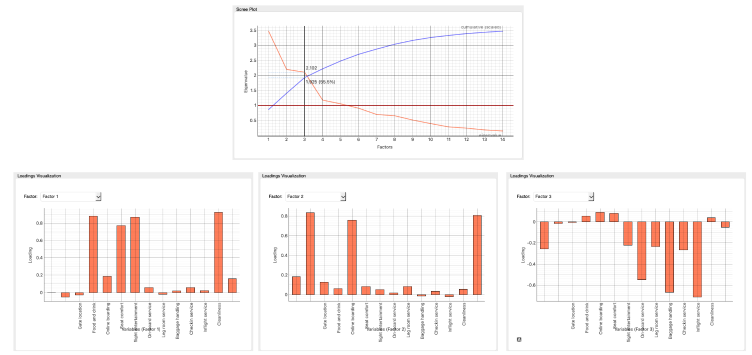
- We found that aggregating the 14 complaint items into just 3 factors still explains 55.5% of the data's variance. In survey analysis, this is a sufficiently high figure. It means that the majority of the variation in customer satisfaction is driven by these three major themes, rather than countless minor reasons.
- Looking at the analysis results, we can interpret clear classifications into three groups:
-
Factor 1: In-flight Comfort (Hardware)
- Components:
Food and Drink,Seat Comfort,Inflight Entertainment,Cleanliness - Interpretation: These items relate to the "physical environment and content" that customers directly interact with, such as seats, meals, entertainment, and cleanliness. A low score here suggests a need for investment in "things," like aircraft renewal or menu improvements.
- Components:
-
Factor 2: Digital & Connectivity
- Components:
Ease of online booking,Online boarding,Inflight wifi service - Interpretation: These items relate to "IT systems and network convenience," from booking and boarding procedures to in-flight Wi-Fi. These are systemic experiences separate from interpersonal service, requiring "technology" solutions like Web/App UI improvements or Wi-Fi capacity expansion.
- Components:
-
Factor 3: Staff & Operations
- Components:
Onboard service,Baggage handling,Inflight service - Interpretation: These items relate to "human service and business processes," such as CA service, baggage handling, and check-in support. This factor benefits from approaches addressing "people and mechanisms," like staff training (hospitality) and operational efficiency improvements.
- Components:
2-2. Dissatisfaction Factor Sensitivity Analysis
In the previous section, we found that the structure of dissatisfaction can be summarized into three areas: "In-flight Comfort (F1)", "Digital (F2)", and "Staff (F3)". So, where should management resources be concentrated? And how much does "service quality" actually impact satisfaction compared to operational factors like "delays"?
We will perform a Sensitivity Analysis to identify the Factor with the greatest impact on overall satisfaction.
Sensitivity Analysis is a method used in business forecasting and planning to analyze how changes in a certain element (variable/parameter) affect the final result (profit, cash flow, etc.). Simply put, it simulates "what-if" scenarios, such as "if Factor 1 performance improves by 20%" or "if Factor 2 worsens by 10%," to identify plan stability, risks, and key items for improvement. This allows for more appropriate and rapid responses in uncertain situations.
Here, we will create a logistic regression model with Satisfaction (Satisfied/Dissatisfied) as the target variable, and the three extracted factors plus other basic attributes (delay time, age, membership type, etc.) as explanatory variables. Let's continue this for Economy Class customers.
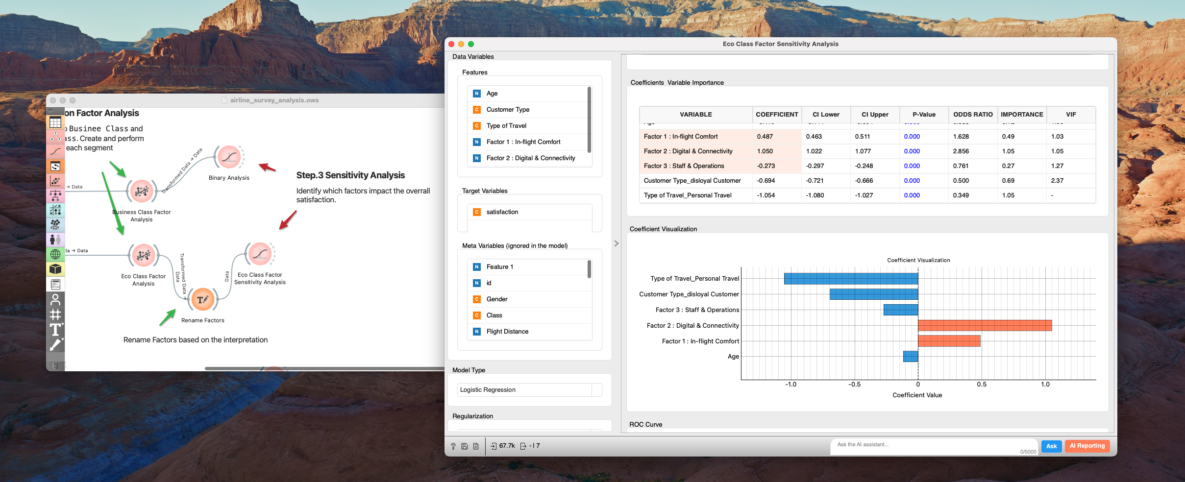
- Use the
Binary Analysiswidget to create a logistic regression model. Add variables that are likely to affect Satisfaction toFeaturesin addition to the 3 factors.
- Select
Factor 1 : In-flight Comfort,Factor 2 : Digital & Connectivity,Factor 3 : Staff & Operations,Customer Type, andType of Travelfor Features. - Check
Fit interceptandNormalize Features, then Apply.
- Check the bar chart in
Coefficient Visualization.
Observations
The resulting graph reveals the following extremely important facts:
-
Overwhelming Importance of Digital Among service-related variables, the coefficient for
Factor 2: Digital & Connectivityis the largest (over 1.0) and positive. This means it has about twice the influence ofFactor 1: In-flight Comfort. -
"System" over "People" On the other hand, the influence of
Factor 3: Staff & Operationsis limited compared to digital factors.
This data confronts us with a truth about Economy Class customer psychology. What they seek is not so much elaborate hospitality or luxurious meals, but a "stress-free digital experience from booking to boarding and in-flight Wi-Fi."
Traditionally, airlines have used "hospitality (human service)" as a source of differentiation, but for Economy Class, digital convenience is the biggest Deal Breaker determining satisfaction.
Please try the same for Business Class following the Template Workflow.
3. Dissatisfaction - Common / Unique Factors
We learned that the main issue for Economy Class is Digital & Connectivity. However, before investing the entire budget into digital based on the overall trend, let's deepen our understanding with higher resolution. Since LTV differs by customer segment, issues facing the revenue pillars must be prioritized. Generally, "Royal Customer (Mileage Members) x Business Trip" travelers are less affected by economic trends or seasons and use flights consistently throughout the year. Also, since they travel on company expenses, they are less price-sensitive and tend to use expensive fare types (Flex) that allow last-minute changes, making them overwhelmingly more profitable than leisure travelers on early-bird discounts.
Here, we will explore common and unique issues by customer segment using Correspondence Analysis. Correspondence Analysis is a method that summarizes the "strength of correlation" between segments and dissatisfaction items into 2 or 3 dimensions to highlight differences in information (variance), often called the categorical version of PCA. Let's try it.
3-1. Segmentation
From the flight experience perspective, we define segments by Class, Type of Travel, and Flight Distance, and further by Customer Type from an LTV perspective.
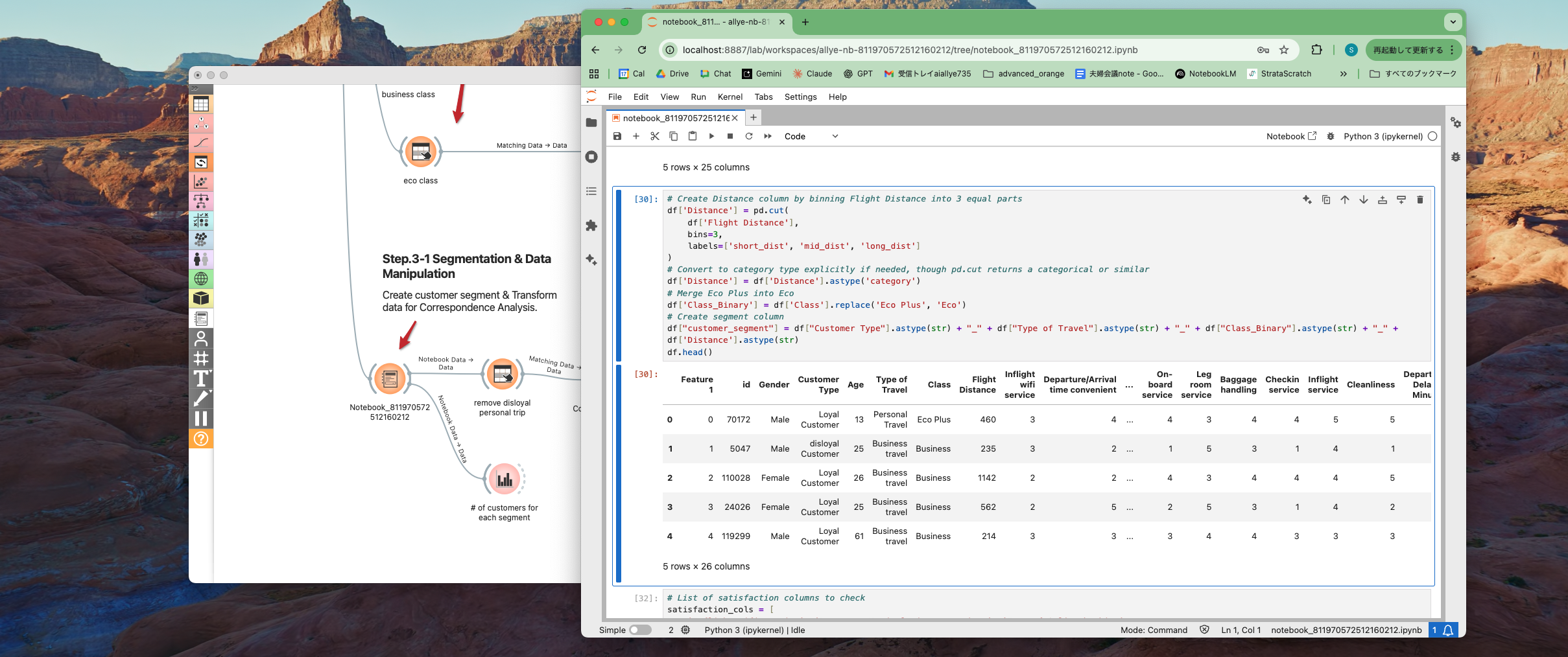
- Open the
Python Notebookwidget and createcustomer_segment.customer_segmentis composed ofCustomer Type+Type of Travel+Class_Binary+Distance, whereDistanceclassifiesFlight Distanceinto three equal intervals:short_dist,mid_dist, andlong_dist.
3-2. Correspondence Analysis
First, process the table to list customer segments and services with strong dissatisfaction (e.g., rating of 2 or lower) for each customer. Create a table like the one below.
| id | worst2_satisfaction | customer_segment |
|---|---|---|
| 1 | Leg room service | disloyal Customer_Business travel_Business_short_dist |
| 2 | Departure/Arrival time convenient | Loyal Customer_Business travel_Business_short_dist |
| 2 | Inflight wifi service | Loyal Customer_Business travel_Business_short_dist |
| 4 | Departure/Arrival time convenient | Loyal Customer_Business travel_Business_mid_dist |
| 4 | Ease of Online booking | Loyal Customer_Business travel_Business_mid_dist |
- Continue data processing in the
Python Notebookwidget.
- Transform the table into a
long formatlike the one above, listing services rated 2 or lower for each customer.
- Use
Bar Plotto aggregate and visualize the number of customers per segment.
- You can see that
disloyal CustomerxPersonal Travelis extremely rare. - On the other hand, looking at
Eco Class, theLoyal Customer,Personal Travel,Short Distancesegment is the largest and most dominant.
- (Optional) Remove extremely rare segments with low LTV, such as
disloyal CustomerxPersonal Travel, from the analysis target. This reduces noise and produces clearer results. - Connect to the
Correspondence Analysiswidget, selectworst2_satisfactionfor Rows, andcustomer_segmentfor Columns.
- Since Inertia is already over 90% with 3 dimensions, 3 Components should be sufficient.
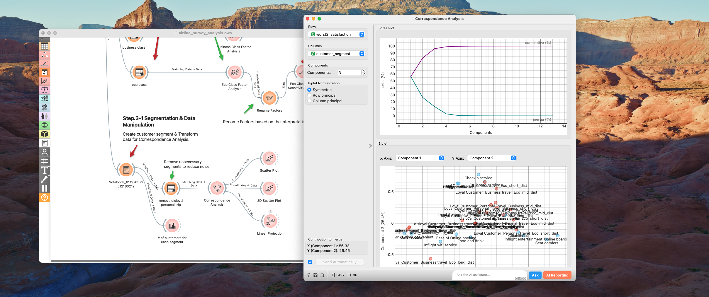
- Since there are many segments and Biplot labels overlap, connect to
Scatter Plotfor visualization in a larger window.
- For higher-dimensional data,
3D Scatter PlotorLinear Projectionare useful.

How to Read the Biplot This map converts customer segments and dissatisfaction into "positional relationships." Read it intuitively using these two rules:
1. Position Rule: Center is "Common," Outer is "Unique"
- Near Center (Origin): "Common Issues" raised on average by all segments gather here. This is the baseline requiring improvement for everyone.
- Outer (Periphery): The further from the center, the more it becomes a "Unique Pain Point" strongly cared about only by specific segments.
2. Distance Rule: Closer means Deeper "Relation"
- The closer the distance between a Red Dot (Customer Segment) and a Blue Dot (Dissatisfaction Item), the more likely that customer segment harbors that dissatisfaction.
- For example, if the
Eco Class Personal Travel(Red) group is right next toSeat comfort(Blue) on the right, it indicates that "Seat comfort is the biggest concern (source of dissatisfaction) for Economy Class personal travelers."
Observations
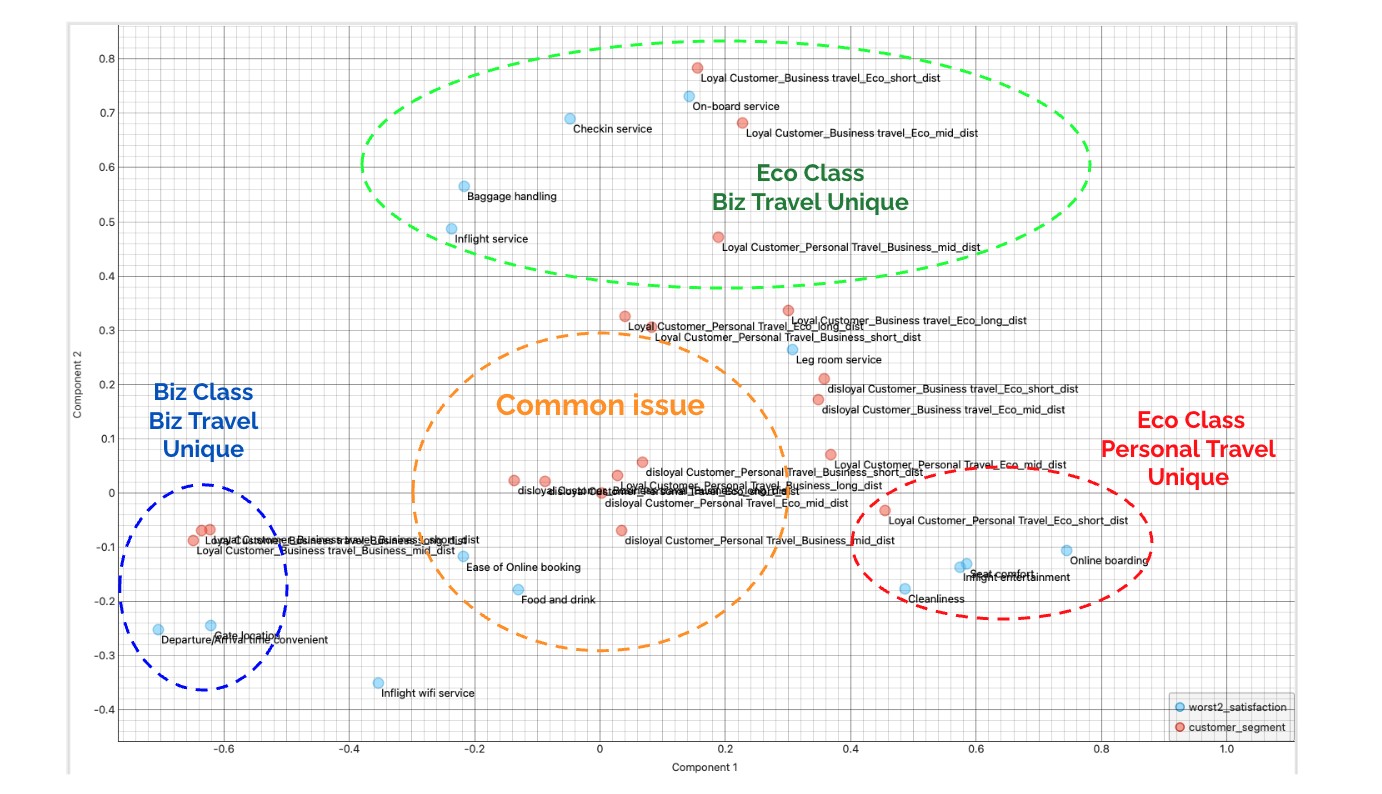
From this data, we can read three clear directions (clusters).
-
🟧 Center: Common Issue
Ease of Online bookingandFood and drinkare common issues regardless of customer segment. Sensitivity analysis also showedEase of Online bookingas a key issue, and it appears it's not limited to Economy.- If a customer segment is located here, it means this segment has no characteristic dissatisfaction (or conversely, is dissatisfied with everything).
-
🟩 Top: Eco Class - Business Travel / (Service Focus)
- "Economy Business Travelers" at the top are sensitive to "Staff Response & Operations" such as
On-board service,Checkin service, andBaggage handling.
- "Economy Business Travelers" at the top are sensitive to "Staff Response & Operations" such as
-
🟥 Right: Eco Class - Right: Personal Travel (Comfort Focus)
- "Personal Travelers" on the right prioritize "In-flight Comfort & Hardware" such as
Seat comfort,Inflight entertainment, andCleanliness.
- "Personal Travelers" on the right prioritize "In-flight Comfort & Hardware" such as
-
🟦 Left: Business Class - Business Travel (Efficiency Focus)
- The Business Class layer on the left has a strong fixation on "Travel Efficiency & Time" such as
Gate locationandDeparture/Arrival time. For them, time is money, and smooth travel is value.
- The Business Class layer on the left has a strong fixation on "Travel Efficiency & Time" such as
Thus, this single map reveals that the necessary measures differ completely depending on who the counterpart is, even for the same "dissatisfaction."
4. Conclusion & Proposal
In this report, we analyzed customer satisfaction data from multiple perspectives, focusing on Economy Class customers. In conclusion, our approach should not be "all-round improvement," but proceed on two axes: "Baseline Digital Transformation" and "Segment-specific Targeted Investment."
4-1. Summary of Findings
- Structure of Dissatisfaction (Factor Analysis): Customer dissatisfaction is not scattered but aggregated into three major pillars: "In-flight Comfort (F1)", "Digital (F2)", and "Staff & Operations (F3)".
- The Biggest Deal Breaker (Sensitivity Analysis): What influences overall satisfaction (especially in Economy Class) the most is not meals or hospitality, but "Digital (Booking/Check-in System)." Low scores here are the biggest factor in customer churn (Deal Breaker).
- Truth of High-LTV Customers (Correspondence Analysis): On the other hand, the most profitable "Business Class x Business Travel" segment cares strongly about "Travel Efficiency (Time/Gate)" more than digital. For them, value lies in a smooth travel process rather than luxury.
4-2. Strategic Proposals
Based on the above analysis, we propose the following three measures.
Proposal 1: Urgent Overhaul of Digital Experience (Priority: High)
Target: All Customer Segments
As the sensitivity analysis shows, the current biggest bottleneck is the IT area, specifically Ease of online booking followed by Online Boarding.
- Action: Allocate budget with top priority to UI/UX renovation of the booking and check-in app.
- Impact: This is an investment not to "gain points" but to "prevent point loss." Unless this is improved, overall satisfaction will not rise no matter how much other services are improved.
Proposal 2: Providing "Time Value" to High-Revenue Customers
Target: Business Class / Business Travel As revealed by Correspondence Analysis, their biggest pain point is "Time and Movement."
- Action: Consider reviewing priority boarding lane operations, shortening the path from arrival to deplaning, and prioritizing the allocation of convenient gate locations.
- Impact: We can maintain and improve their LTV through operational ingenuity without relying on human services.
Proposal 3: Optimization of Resource Allocation by Segment
Target: Eco Business (Road Warriors) vs Eco Personal
- Action:
- Eco Business Layer: For this layer with high volume and repeat rates, strengthen operational efficiency such as "rapid baggage return" and "smooth boarding."
- Eco Personal Layer: Focus on expanding in-flight entertainment content and maintaining cleaning quality.
Closing
How was it? I hope the analysis results showed you that each customer has unique issues, and that "satisfying all customers equally" carries the risk of resource dispersion, resulting in a service that resonates with no one. At the same time, I hope you experienced how stepping deeper from simple aggregation in survey analysis allows for a higher-resolution understanding of customers, which becomes the inspiration for actionable measures.
This tutorial can also serve as a template for your survey analysis. Let's get started!