Exploratory data analysis
Financial authorities and the audit department have raised concerns regarding potential unfair lending practices. Specifically, they questioned whether some customers are being assigned unjustified interest rates. We need to analyze the data and identify any customers who deviate significantly from this standard.
As a data scientist, you will frequently encounter requests of this nature. The challenge lies in the ambiguity: there is no pre-defined "justified interest rate." While you could ask stakeholders for a definition, non-technical stakeholders often struggle to articulate it. This is where your creativity come into play: using data to craft a simple, compelling logic for appropriate rates, and turning that insight into a narrative that resonates with stakeholders. Before proceeding with the tutorial, take a moment to consider: How would you approach this analysis?
This guide walks through a practical EDA workflow in Allye using the sample LendingClub loan data. Below is a table summarizing the key variables and their meanings:
| Variable | Description |
|---|---|
| loan_amnt | Amount of loan requested by the customer |
| term | Loan term length (e.g., 36 or 60 months) |
| int_rate | Interest rate assigned to the loan |
| installment | Fixed monthly payment amount for the loan |
| grade | Creditworthiness category (A = best, G = worst) |
| sub_grade | Sub-category of credit grade (e.g., A1, B2) |
| loan_status | Current status of the loan (e.g., fully paid, charged off, late) |
| funding amounts | Amount of loan actually funded or received |
1. Understand the overall structure
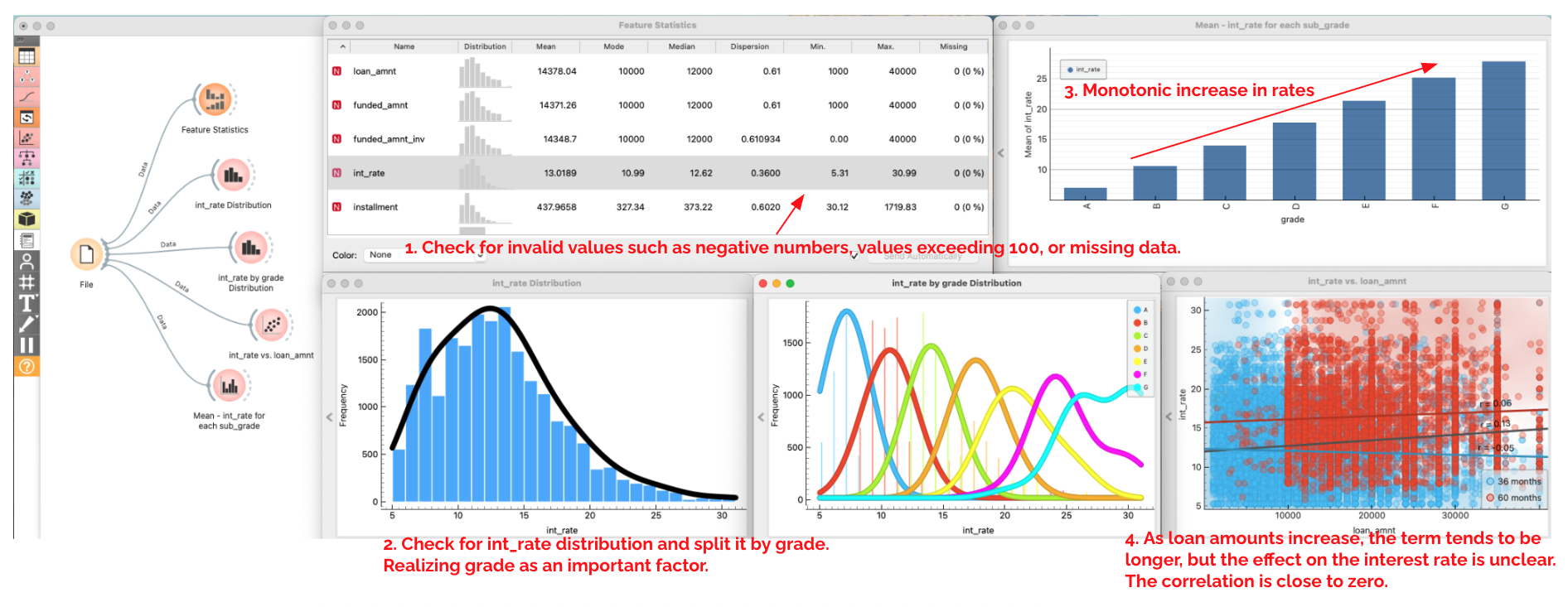
Let's start by using some simple visualizations to understand the basic structure of the data. A straightforward first step is to check for missing values or outliers—such as negative interest rates—which could signal unjustified rates.
- Connect
File → Feature Statisticsto summarize missing values, min/max, and outliers. Confirm there are no impossible values (negative amounts, rates above 100, etc.). - Add
Distributionsto view the shape ofint_rateoverall, split bygradeandterm; you should see lower rates for better grades. - Use
Scatter Plotto viewint_ratevs.loan_amnt, coloring byterm. Within each grade segment, there is no clear correlation betweenloan_amntandint_rate. - Use
Bar Plotto viewMean - int_ratefor eachsub_grade; you should see monotonic increase in rates from gradeA1toG5. - Take notes on the pattern you found.
2. Define a fair interest rate model
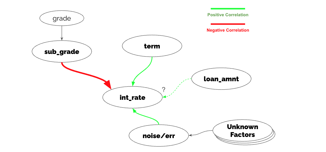
While some interest rates exceed 30%, this often stems from lower credit grades and longer loan terms, so we cannot immediately label them as "incorrect." Since interest rates are clearly determined by multiple factors, their "appropriateness" must be evaluated holistically. A "break in correlation"—for example, a Grade A1 customer with a short term being assigned an unusually high rate—could be a clue to solving this problem. Let's organize our hypotheses about the drivers of interest rates before validating them with data.
- Draft a diagram in your notes. Connect nodes with green edges for positive correlations and red edges for negative correlations. 単純に
-
Formulate hypotheses:
- It is intuitive that lower-grade customers are assigned higher rates.
- Longer repayment terms increase the lender's risk, so higher rates are expected.
- While the relationship between loan amount and interest rate isn't immediately clear from the scatter plot, intuitively, larger amounts might carry higher default risks, leading to higher rates.
-
Identify unobserved factors:
- We can assume factors like employment type or annual income are partly explained by sub_grade.
- However, macro factors (e.g., Federal Reserve rates) are not present in this dataset. We will define these as unobserved factors.
3. Build a regression model and test your hypothesis
The hypothesis we just formed can be modeled using Linear Regression, a practical and fundamental statistical framework. In Allye, use the Regression Analysis widget to verify the validity of your model.
- Send the data to
Regression Analysiswithint_rateas the target and features such asloan_amnt,term, andsub_grade. Start with no regularization.
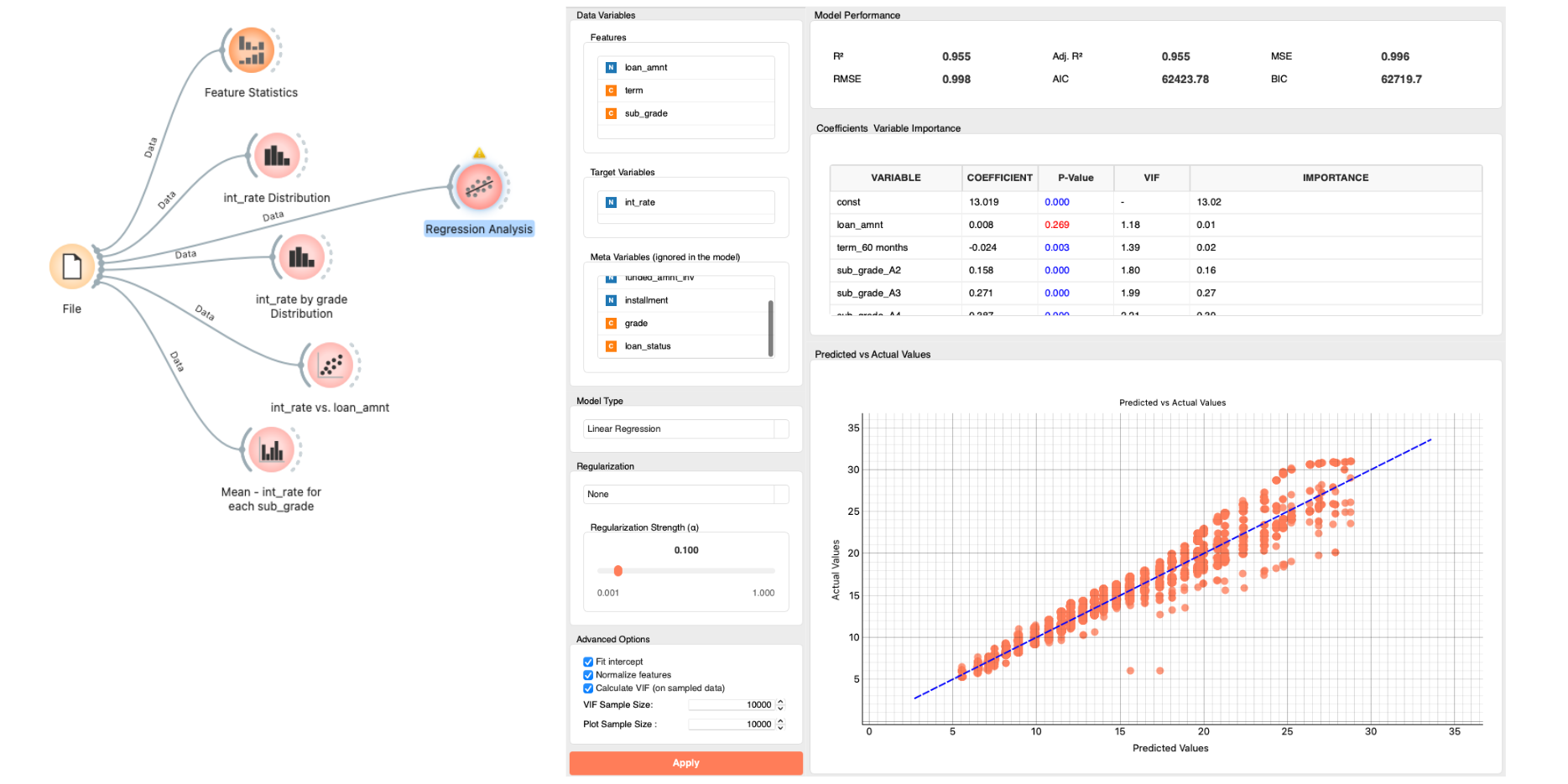
- Review model output to test your hypothesis.
- Check the P-values: Confirm if the correlations are statistically significant.
gradeshows a significant correlation; as the grade worsens, the rate increases.loan_amnthas ap-value> 0.05, indicating no significant correlation.termshows a negative correlation (contrary to expectation) but its impact is small compared tograde, which is the dominant factor.
- Check
R2andPrediction vs Actual: Does your hypothesis explain the interest rates well?- An
R2of 0.955 means that 95.5% of the variation in interest rates is explained by the current features. The remaining 4.5% is due to other factors, butgradeandtermexplain the vast majority.
- An
- Update your diagram. Since loan_amnt does not have a significant relationship with interest rates, remove it from your conceptual diagram.
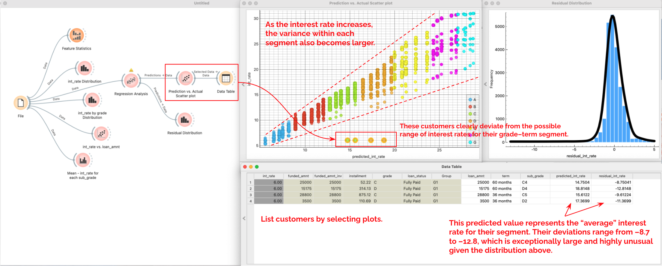
4. Residual Analysis & List customers likely "unjustified"
-
Connect
PredictionsfromRegression Analysisto aScatter Plotto view the Predicted vs. Actual values.- Observation: As the interest rate increases, the variance within each segment also becomes larger. This implies that while rates for high-grade customers are almost uniquely determined by grade and term, lower-grade customers are influenced by other factors.
- Anomaly: You can see customers in grades C and D deviating significantly from the trend.
-
Select these 4 outlier plots and connect
Selected Datato aData Table -
Connect
PredictionstoDistributionsto view theResidual Distribution.- The predicted value represents the “fair average” interest rate for their segment. Their deviations range from –8.7 to –12.8, which is exceptionally large and highly unusual given the overall distribution.
5. Conclusion & Proposal
Derive the final conclusion from the key facts found.
-
Defining "Incorrect Rates": We initially approached this by looking for "invalid values" and "broken correlations."
- Invalid values (e.g., negative rates, >100%, missing values): None were found.
- Therefore, we focused on "broken correlations."
-
Establishing the Standard: We built a Fair Interest Rate Model and validated it using regression.
- The model explains 95% of the variance across all customers.
- For higher-grade customers specifically,
gradeandtermexplain the rates almost perfectly. - The regression line represents the "fair average" rate for a given segment.
-
Identifying Affected Customers: We found 4 customers (Grades C and D) who deviate significantly from the regression line.
- Their rates are uniformly set at 6%, whereas based on their grade and term, their rates are predicted to be around 15%–17%.
- Since this logic correctly explains the rates for thousands of other customers, we can confidently claim that 15–17% is the "fair rate" for these individuals.
- Conclusion: These 4 customers are outliers. Their rates (6%) are significantly lower than the fair market rate (15-17%) for their risk profile. While this benefits the customer, from an auditing perspective, this represents an unjustified deviation from our pricing policy, likely caused by a system error or manual override that needs correction.