A/B Test Result Analysis
Your A/B test for the new product feature has concluded. Let’s analyze the data to determine whether there was a statistically significant effect.
One of the most common types of data analysis is evaluating experimental results. In tech companies and research organizations, countless experiments are conducted. It’s rare for a single trial to produce the expected outcome right away—in many cases, the results are “flat,” showing no clear effect.
But this is exactly when data analysis becomes truly valuable. Even when the results aren’t as hoped, by digging into the experiment’s data, you can discover new insights, hints, and inspiration. These lead to refining your ideas, which can ultimately result in new discoveries and business value.
In this section, we’ll learn a framework for breaking down and analyzing experimental results using Allye.
Tutorial overview
This tutorial walks through a full experiment analysis in Allye. You will:
- Validate randomization with an A/A test and visual checks.
- Run the A/B test, interpret effect size and p-values.
- Apply CUPED to reduce variance and increase power.
- Segment users via stratification and clustering to find heterogeneous effects.
- Use causal inference (Causal Tree and Causal Forest) to predict individual treatment effects (ITE or CATE: conditional average treatment effect) and explore drivers.
Note: You can find following workflow files in Template Workflows
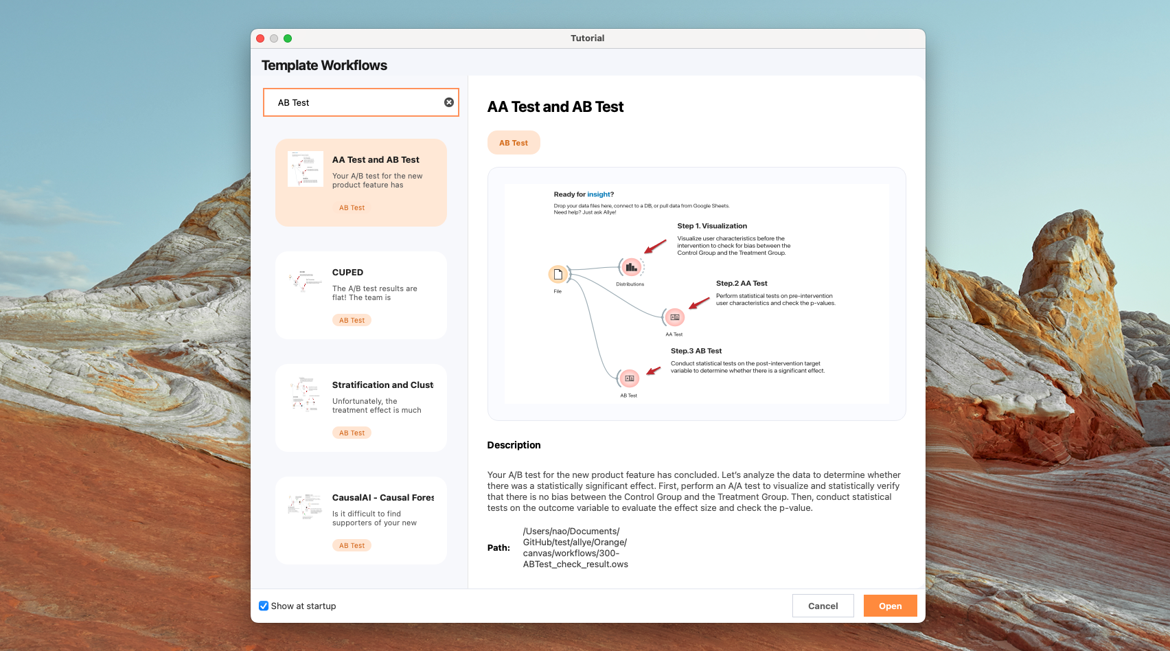
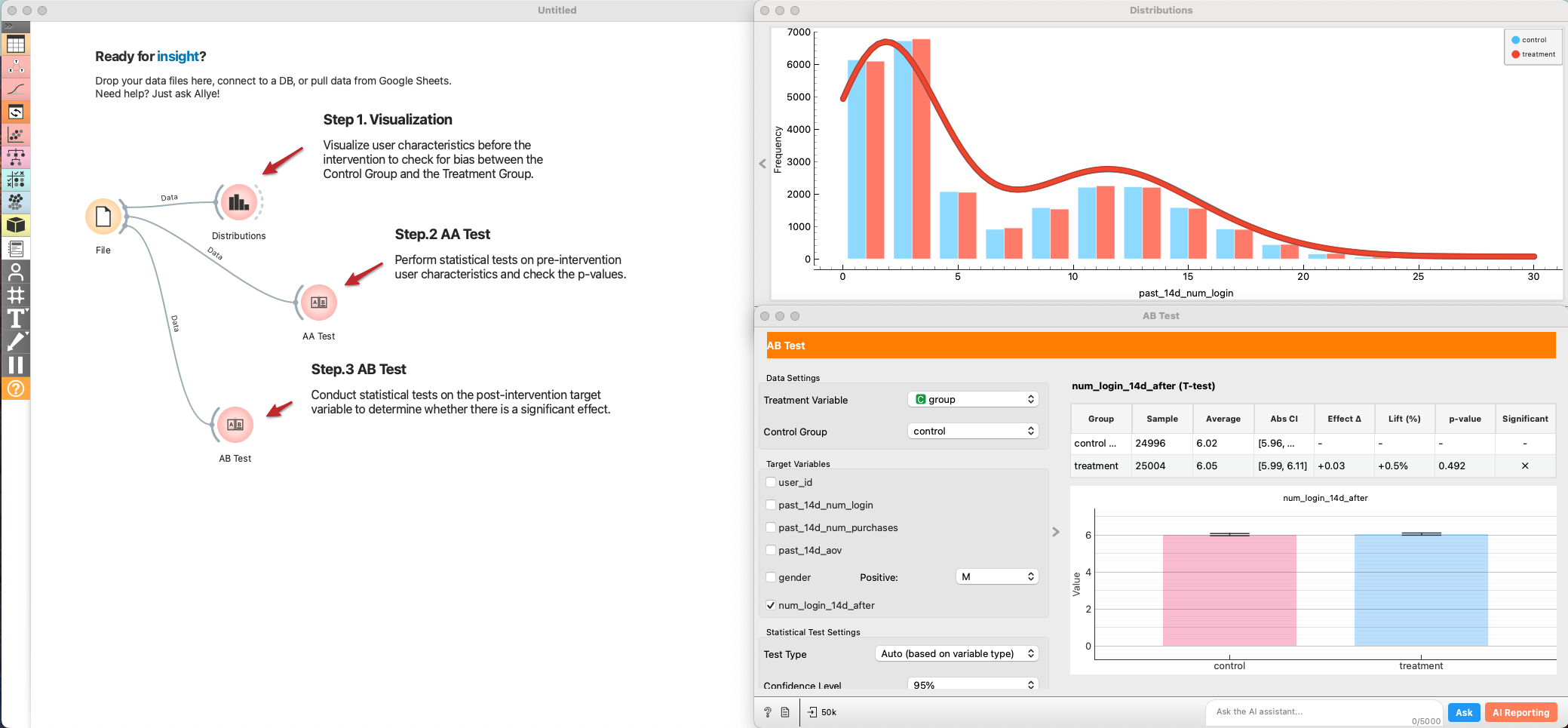
1. A/A Test (randomization check) & A/B Test (hypothesis testing)
First, perform an A/A test to visualize and statistically verify that there is no bias between the Control Group and the Treatment Group. Then, conduct statistical tests on the outcome variable to evaluate the effect size and check the p-value.
-
Add a
Filewidget and load the experiment dataset. -
Connect
File → Distributionsto visualize baseline variables (e.g., past logins, purchases, demographics) split by grade. Look for overlap between control and treatment. -
Connect
File → AB Testand set it to an AA Test (test type = Auto/AA). Select several pre-period metrics as targets. Review:- Effect size (should be near zero if randomized well).
- p-value (should be non-significant (> 0.05); a small p-value hints at allocation bias).
- If you see systematic differences, investigate assignment logic before trusting AB results.
-
Add another
AB Testwidget connected toFile. -
Pick the post-period target metric (e.g., num_login).
-
Interpret:
- Effect size and confidence interval.
- p-value and power. If p-value is borderline and power is low, consider variance reduction (next section).
2. CUPED (variance reduction)
The A/B test results are flat! Before giving up, let's sharpen our view. Sometimes the signal is drowned out by the natural variance in user behavior. We use CUPED (Controlled Experiments Using Pre-Existing Data) to subtract this noise and increase statistical power.
- CUPED is a method proposed by Meta researchers to reduce variance in A/B tests and improve statistical power (Deng et al., 2013). In a standard A/B test, even with random assignment, individual behavioral variability can be large, requiring a substantial sample size to detect experimental effects. CUPED addresses this issue by using pre-experiment data as covariates, based on the idea of reducing noise.
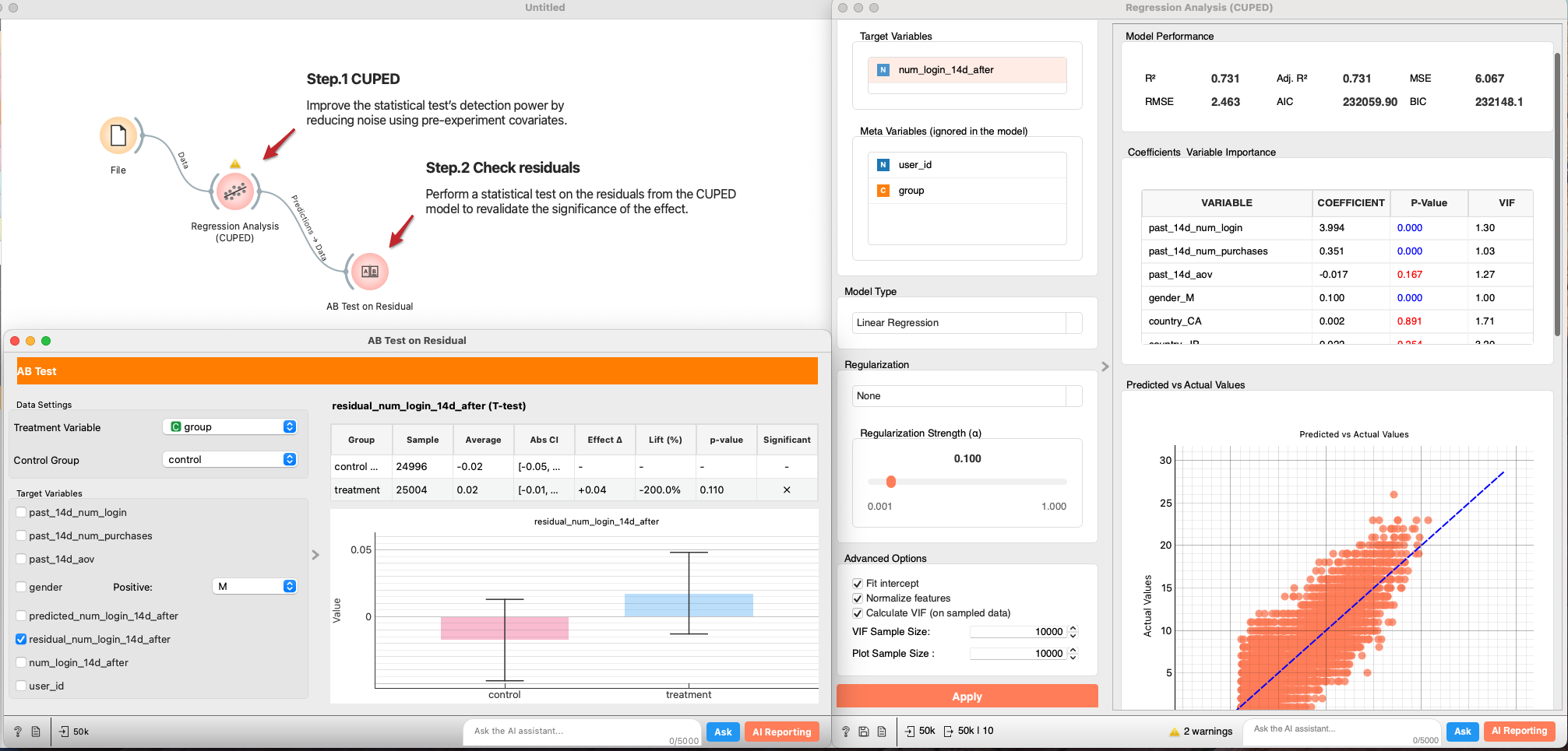
- Connect
File → Regression Analysis. - In
Features, select pre-experiment covariates (e.g., past 14d logins/purchases). Set the post-period outcome as the target. Regularization: None (for a plain CUPED baseline), or add if you have many covariates. - From the regression output, send Predictions → AB Test.
- Re-run the AB test on residuals. A smaller standard error and lower p-value indicates CUPED successfully reduced variance.
P-value was reduced but still not statistically significant. Let's move on to the next analysis.
3. Stratification and Clustering (segment effects)
If the average effect is zero, but the p-value is dropping, it’s possible that positive and negative effects are canceling each other out. Let's hypothesize that "Heavy Users" might like the new product feature, while "Light Users" find it cluttered. Let’s explore the data and identify differences in effect size across segments. Here, we stratify or cluster the data to segment users and estimate the effect size for each segment.
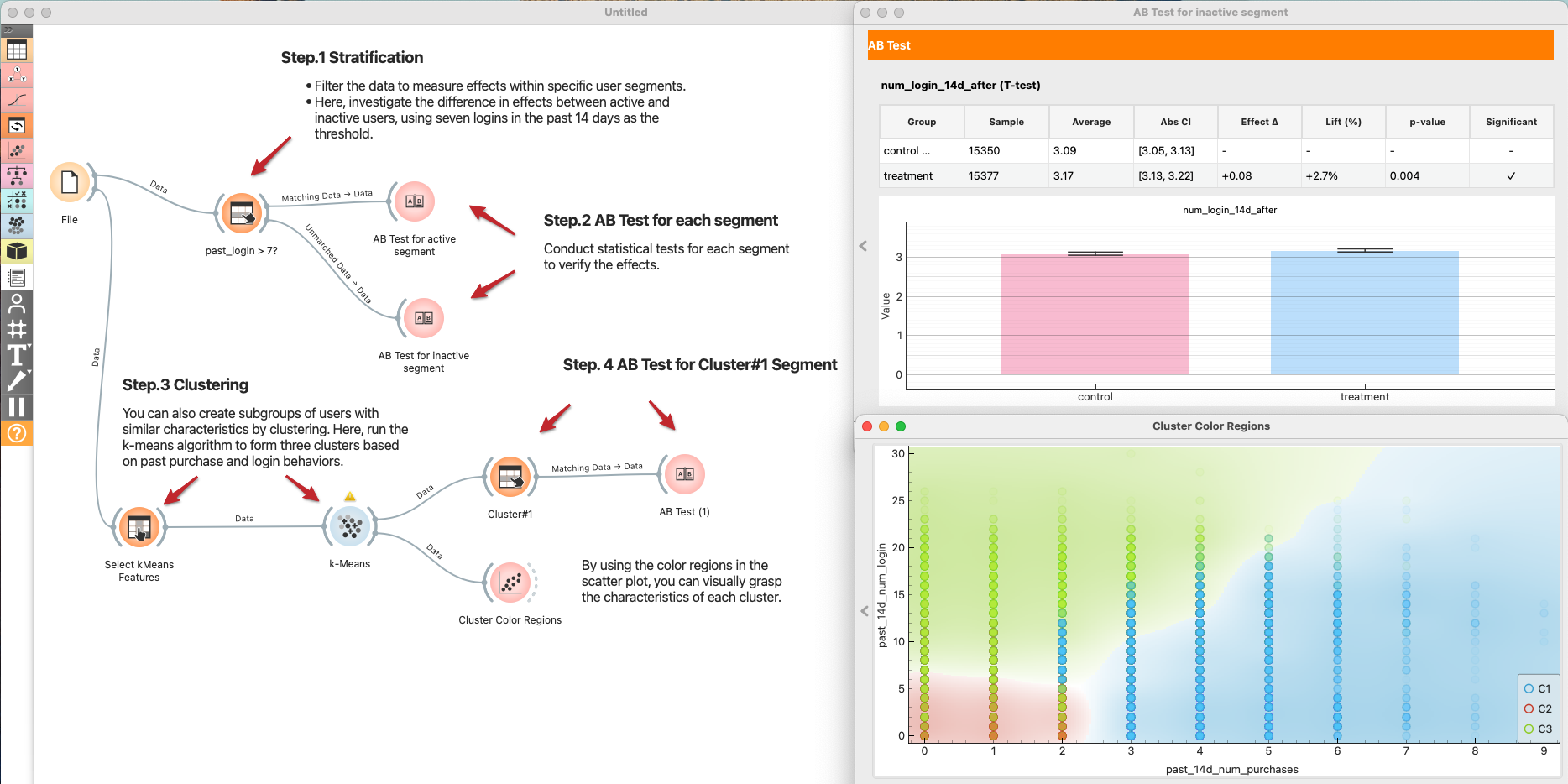
Stratification
- Define Segments:
File → Select Rowsto create a segment, e.g., active users withpast_login_14d > 7. - Test per Segment:
- Send Matching Data → AB Test for the active segment.
- Send Unmatched Data → AB Test for the inactive segment.
- Compare effect sizes and p-values across segments.
Clustering (optional)
If you don't have a clear hypothesis, let Clustering find the segments.
File → Select Columnsto choose clustering features (e.g., past logins, purchases).Select Columns → k-Means(k=3 as a start; normalize features).k-Means → Scatter Plotto color users by cluster and understand their profiles.k-Means → Select Rows (Cluster#1) → AB Testto estimate effects per cluster. Repeat for other clusters.- Summarize which clusters respond positively and which do not.
4. Causal inference for CATE estimate
We now know the effect varies by user. Instead of manually guessing segments, let's use Causal AI to predict the exact Treatment Effect (CATE) for every single user. Use these prediction results to gain a deeper understanding of your supporters’ personas.
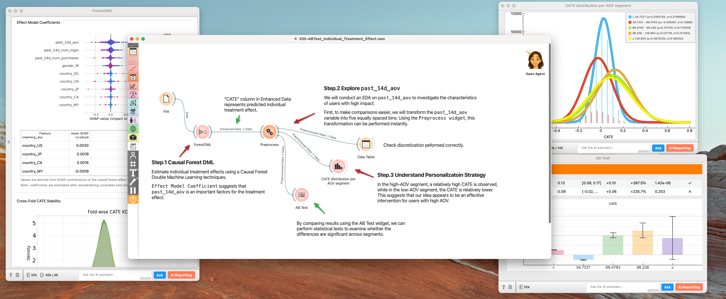
- Causal Forest DML:
File → Forest DML.Causal Forest Double Machine Learningis designed to robustly estimate Conditional Average Treatment Effects (CATE) by combining orthogonalization with a causal forest for heterogeneous treatment effect modeling. -- Susan Athey "Generalized Random Forests" (2019) - Inspect:
Effect Model Coefficientin theForest DMLsuggests thatpast_14d_aovis an important factors for the treatment effect.- Discretize
past_14d_aovto 5 segments (very high ~ very low). to make comparisons easier.Preprocesswidget comes in handy.
- Understand Personalization Strategy
- In the high-AOV segment, a relatively high CATE is observed, while in the low-AOV segment, the CATE is relatively lower. This suggests that our idea appears to be an effective intervention for users with high AOV.
- Use these insights to target future rollouts (e.g., enable the feature only for high-CATE segments).
5. Refining our strategy
By moving beyond simple averages, we turned a "failed" experiment into a strategic insight. Here is what we found and what we propose.
1. The Discovery: Inactive - High AOV Users
Initial A/B test results showed a flat trend overall. However, through Stratification and Causal Forest DML analysis, we uncovered a striking contrast:
- Inactive & High-AOV Users: Showed a statistically significant uplift in engagement and conversion.
- Interpretation: For users who are unfamiliar with our product catalog (New Users) or haven't visited in a while (Dormant Users), this feature successfully acts as a "activation engine".
2. Strategic Proposal: Pivot to "Activation & Reactivation"
Instead of a general rollout (which risks annoying our loyal base), we propose repacking this feature as a dedicated Growth Tool.
- Targeted Rollout: Enable the widget exclusively for:
- New Users: To assist with onboarding and first purchase.
- Dormant Users: As part of "Welcome Back" campaigns to boost reactivation.
- Low-AOV Segments: To encourage cross-selling and increase basket size. Hide for Power Users: Keep the interface clean for high-frequency users to maintain their efficiency.
3. Next Steps: Long-term Value Verification
Short-term clicks don't always translate to long-term loyalty.
- Long-term Holdout: We will maintain a small control group within the "Inactive" segment for the next 6 months.
- Key Metrics: We must monitor Retention Rate and LTV to ensure the "reactivated" users stay engaged and don't churn after the novelty wears off.
Summary: The data saved us from scrapping a valuable feature. By identifying who benefits (Inactive/Low-AOV), we can deploy this feature where it creates the most value—turning cold traffic into active customers.