Personalize Email Campaign-MineThatData Challenge

MineThatData E-Mail Analytics And Data Mining Challenge was originally published in 2008 from MineThatData, this dataset invites us to solve a timeless marketing problem: How do we personalize campaigns?
In this post, we'll dive into this dataset using Causal Inference to uncover not just which campaign worked best, but why and how to improve.
The Data
First, let's get familiar with what we're looking at. The dataset contains 64,000 customers who made a purchase within the last 12 months. These customers were part of a randomized email experiment:
- 1/3 received an email featuring Mens merchandise.
- 1/3 received an email featuring Womens merchandise.
- 1/3 were in the Control group (no email).
We have two weeks of tracking data following the campaign to see if these emails actually drove results.
The Attributes
Here is a summary of the dataset attributes:
| Variable Name | Description | Example Values / Notes |
|---|---|---|
| Recency | Months since last purchase | 1, 4, 12 |
| History_Segment | Categorical buckets for dollars spent in the past year | $0-$100, $100-$200, etc. |
| History | Actual dollar value spent in the past year | 76.50, 340.00 |
| Mens | Purchased Mens merchandise in the past year (1/0) | 1 = Yes, 0 = No |
| Womens | Purchased Womens merchandise in the past year (1/0) | 1 = Yes, 0 = No |
| Zip_Code | Customer location type | Urban, Suburban, Rural |
| Newbie | New customer in the past 12 months (1/0) | 1 = Yes, 0 = No |
| Channel | Purchase channel in the past year | Web, Phone, Multichannel |
| Segment | Which campaign the customer received | Mens E-Mail, Womens E-Mail, No E-Mail |
Post-campaign outcome variables (tracked in the 2 weeks after the campaign):
| Variable Name | Description | Example Values |
|---|---|---|
| Visit | Visited the website in the two weeks after campaign (1/0) | 1 = Yes, 0 = No |
| Conversion | Purchased merchandise post-campaign (1/0) | 1 = Yes, 0 = No |
| Spend | Dollars spent in the two weeks after campaign | 0.00, 24.99, 140.00 |
The Goal
The challenge poses several questions, but they essentially boil down to this:
- Overall Performance: Did the emails work? Which one was better?
- Targeting: If we could only send emails to the best 10,000 customers, who should they be? Who should we avoid?
- The "Why": Can we explain the drivers behind these results?
Let's see how a causal approach can answer these better than simple averages.
1. A/B Testing
We start with the basics. Using the A/B Test node for statistical test, we first run a sanity check (A/A Test) to confirm the randomization was valid. Then, we look at the main metrics: Conversion, Visit, and Spend.
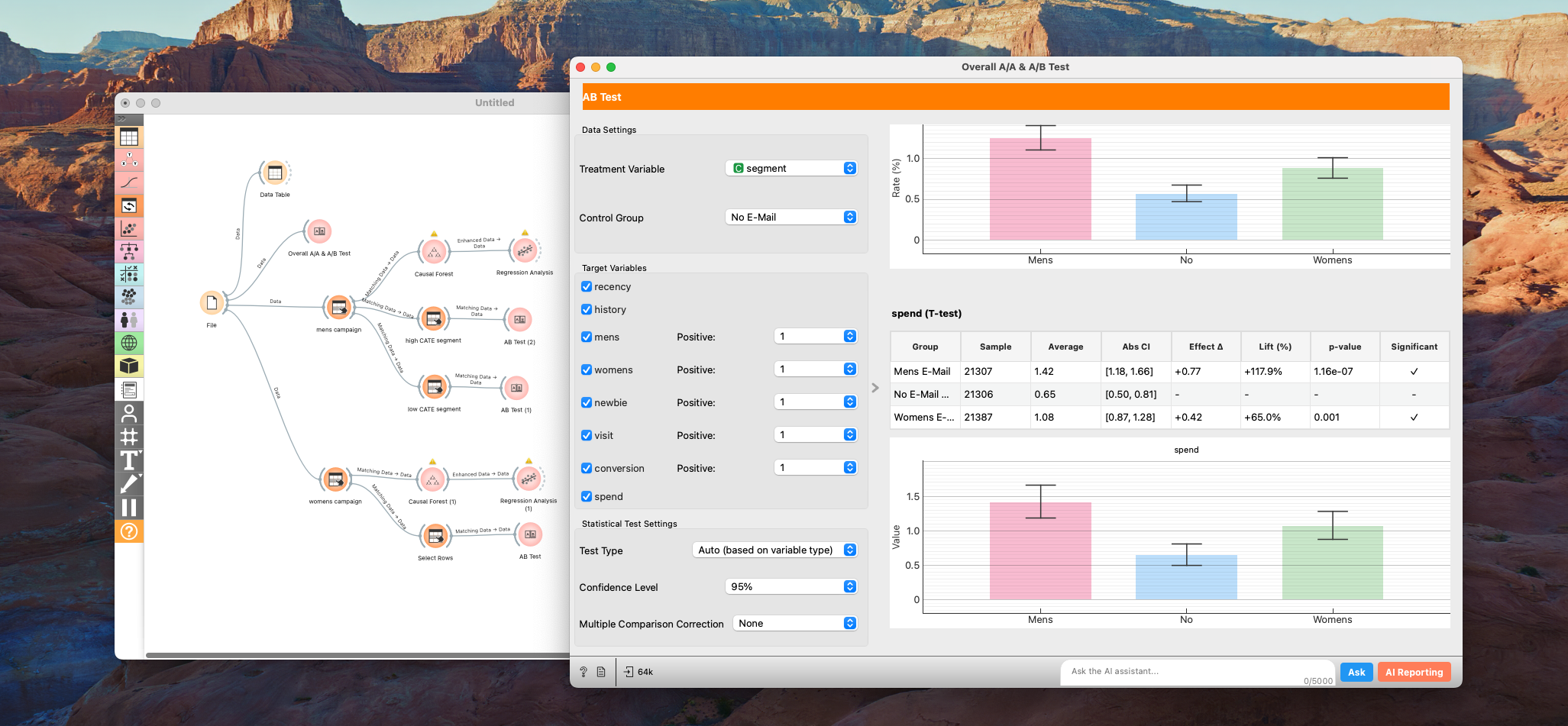
Results
Summary of A/B Test Results
| Metric | Group | Sample Size | Mean / Rate (%) | 95% CI (Mean/Rate) | Effect Δ | Lift (%) | p-value | Significant |
|---|---|---|---|---|---|---|---|---|
| Recency | Mens E-Mail | 21,307 | 5.77 | [5.73, 5.82] | +0.02 | +0.4% | 0.481 | No |
| No E-Mail (Control) | 21,306 | 5.75 | [5.70, 5.80] | – | – | – | No | |
| Womens E-Mail | 21,387 | 5.77 | [5.72, 5.81] | +0.02 | +0.3% | 0.593 | No | |
| History | Mens E-Mail | 21,307 | 242.84 | [239.34, 246.33] | +1.95 | +0.8% | 0.432 | No |
| No E-Mail (Control) | 21,306 | 240.88 | [237.49, 244.28] | – | – | – | No | |
| Womens E-Mail | 21,387 | 242.54 | [239.11, 245.96] | +1.65 | +0.7% | 0.501 | No | |
| Mens | Mens E-Mail | 21,307 | 55.1% | [54.4%, 55.8%] | -0.2pp | -0.4% | 0.643 | No |
| No E-Mail (Control) | 21,306 | 55.3% | [54.7%, 56.0%] | – | – | – | No | |
| Womens E-Mail | 21,387 | 54.9% | [54.2%, 55.6%] | -0.4pp | -0.8% | 0.378 | No | |
| Womens | Mens E-Mail | 21,307 | 55.1% | [54.5%, 55.8%] | +0.4pp | +0.7% | 0.439 | No |
| No E-Mail (Control) | 21,306 | 54.8% | [54.1%, 55.4%] | – | – | – | No | |
| Womens E-Mail | 21,387 | 55.0% | [54.3%, 55.7%] | +0.2pp | +0.4% | 0.616 | No | |
| Newbie | Mens E-Mail | 21,307 | 50.2% | [49.5%, 50.8%] | -0.0pp | -0.1% | 0.934 | No |
| No E-Mail (Control) | 21,306 | 50.2% | [49.5%, 50.9%] | – | – | – | No | |
| Womens E-Mail | 21,387 | 50.3% | [49.7%, 51.0%] | +0.1pp | +0.3% | 0.799 | No | |
| Visit | Mens E-Mail | 21,307 | 18.3% | [17.8%, 18.8%] | +7.7pp | +72.1% | 0.000 | Yes |
| No E-Mail (Control) | 21,306 | 10.6% | [10.2%, 11.0%] | – | – | – | No | |
| Womens E-Mail | 21,387 | 15.1% | [14.7%, 15.6%] | +4.5pp | +42.6% | 0.000 | Yes | |
| Conversion | Mens E-Mail | 21,307 | 1.3% | [1.1%, 1.4%] | +0.7pp | +118.8% | 0.000 | Yes |
| No E-Mail (Control) | 21,306 | 0.6% | [0.5%, 0.7%] | – | – | – | No | |
| Womens E-Mail | 21,387 | 0.9% | [0.8%, 1.0%] | +0.3pp | +54.3% | 0.000 | Yes | |
| Spend | Mens E-Mail | 21,307 | 1.42 | [1.18, 1.66] | +0.77 | +117.9% | 0.000 | Yes |
| No E-Mail (Control) | 21,306 | 0.65 | [0.50, 0.81] | – | – | – | No | |
| Womens E-Mail | 21,387 | 1.08 | [0.87, 1.28] | +0.42 | +65.0% | 0.001 | Yes |
Note: "pp" means "percentage points" for difference in rates.
No selection bias and both campaigns drove statistically significant lift across all metrics compared to the control group. However, the Mens campaign was the clear winner:
- Mens Campaign: +$0.77 spend per customer.
- Womens Campaign: +$0.42 spend per customer.
At a high level, you might conclude: "Great, send the Men's email to everyone!" But as professionals, let's optimize further.
2. Beyond Averages: Finding the Best (and Worst) Customers
The challenge asks an interesting question:
If you could only send emails to the best 10,000 customers, who would they be? Conversely, who would you suppress?
This is where the job of an analyst splits into two equally important paths:
- The Algorithmic Path: Accurately identifying the top/bottom 10k users to maximize ROI.
- The Insight Path: Explaining why these users are the best/worst to stakeholders.
In my experience, mastering the Algorithmic Path gets you a bigger bonus. On the other hand, Mastering the Insight Path gets you trusted and promoted. The former powers the system; the latter powers the strategy.
Step 1: Estimating CATE
To solve the algorithmic part, we can estimate the Conditional Average Treatment Effect (CATE) for each user. This tells us the expected lift (or loss) for a specific individual if they receive the email.
In Allye, we can use the Causal Forest to predict CATE for spend.
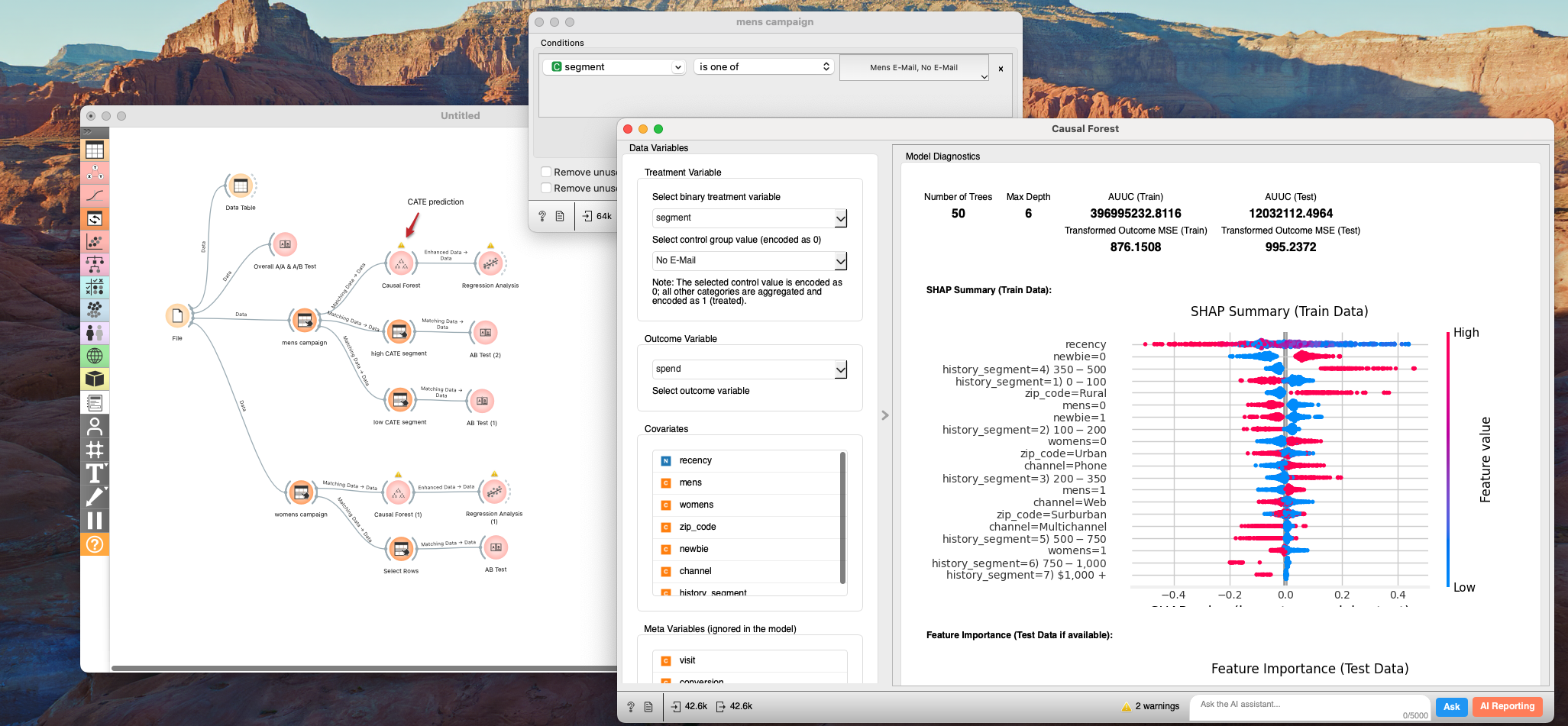
By sorting customers based on their predicted CATE, we can easily slice the Top 10k (Best) and Bottom 10k (Worst).
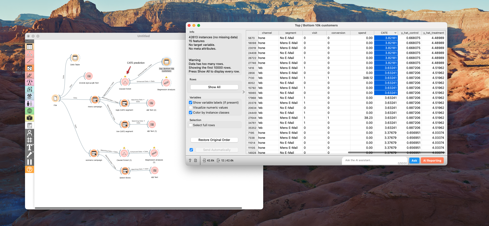
This gives us our target list. But we're not done yet. We need to understand who these people are.
3. The "Why": Analyzing the Drivers
Now we move on to the "Insight Path." Since we already have CATE predictions for each individual, it makes sense to dig deeper into what drives these effects. Of course, we should keep in mind that predictions have errors, so it's important to use these CATE-based insights as a starting point and then carefully validate them with targeted, stratified-A/B testing.
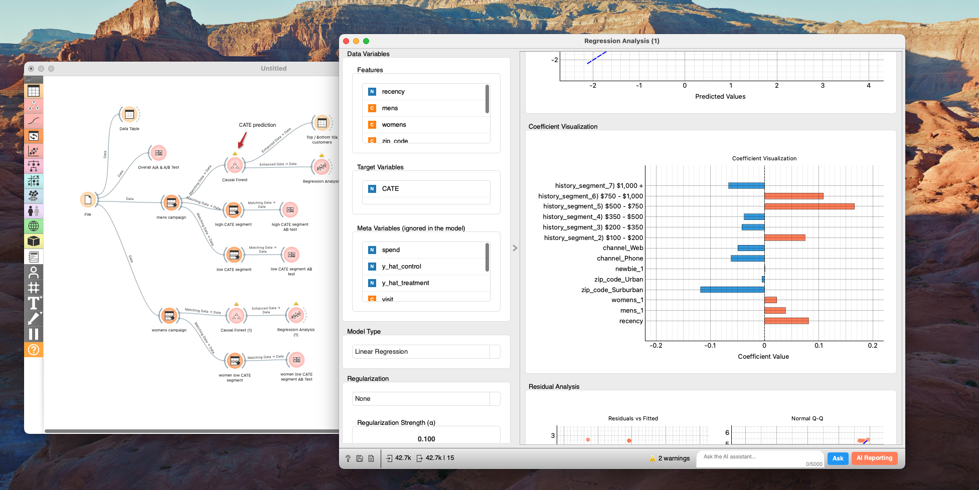
We can use Regression Analysis or Decision Trees to see which features correlate most strongly with a high CATE.
The Mens Campaign: A Success Story
For the Mens campaign, the analysis highlights three key drivers: History (past spend), Recency (months since last purchase), and Channel (Phone vs Web vs Multichannel).
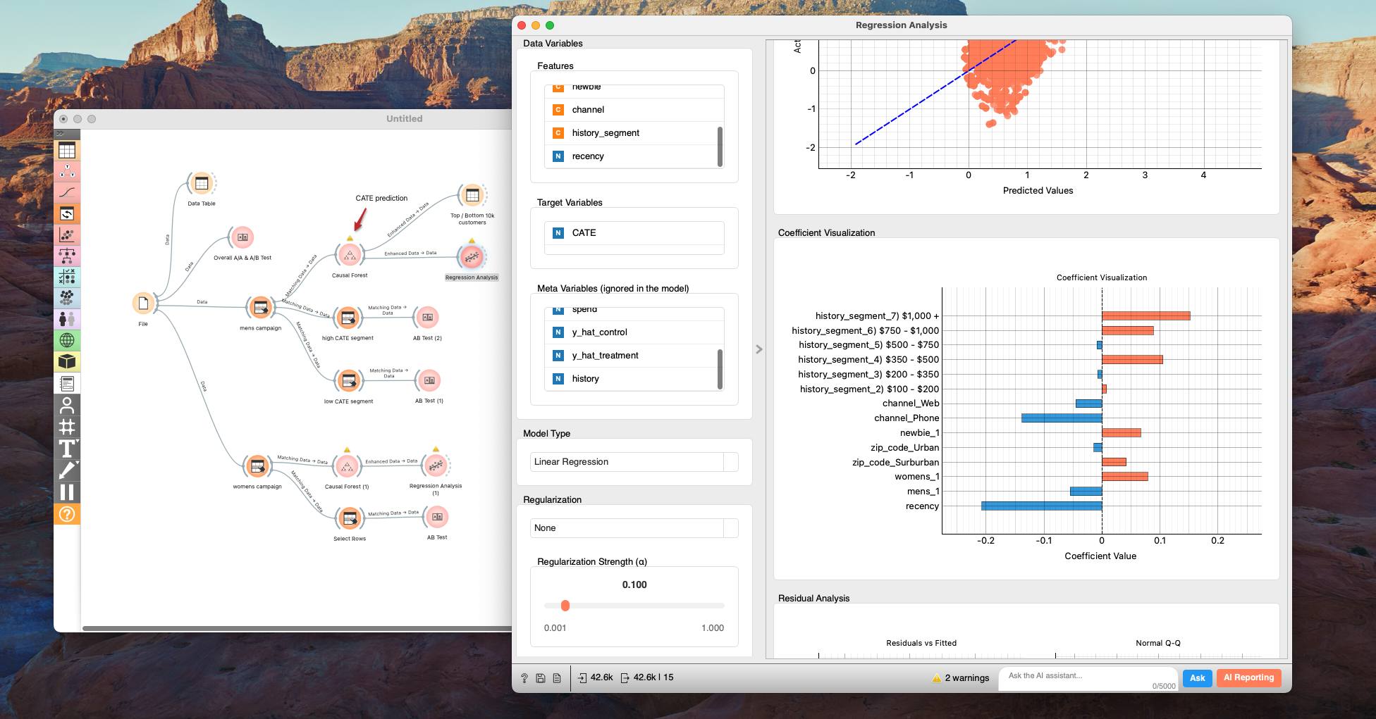
The highest lift comes from users who:
- Are heavy spenders with a solid purchase history
- Made a recent purchase (short time since last purchase)
- Shop through multiple channels (Multichannel)
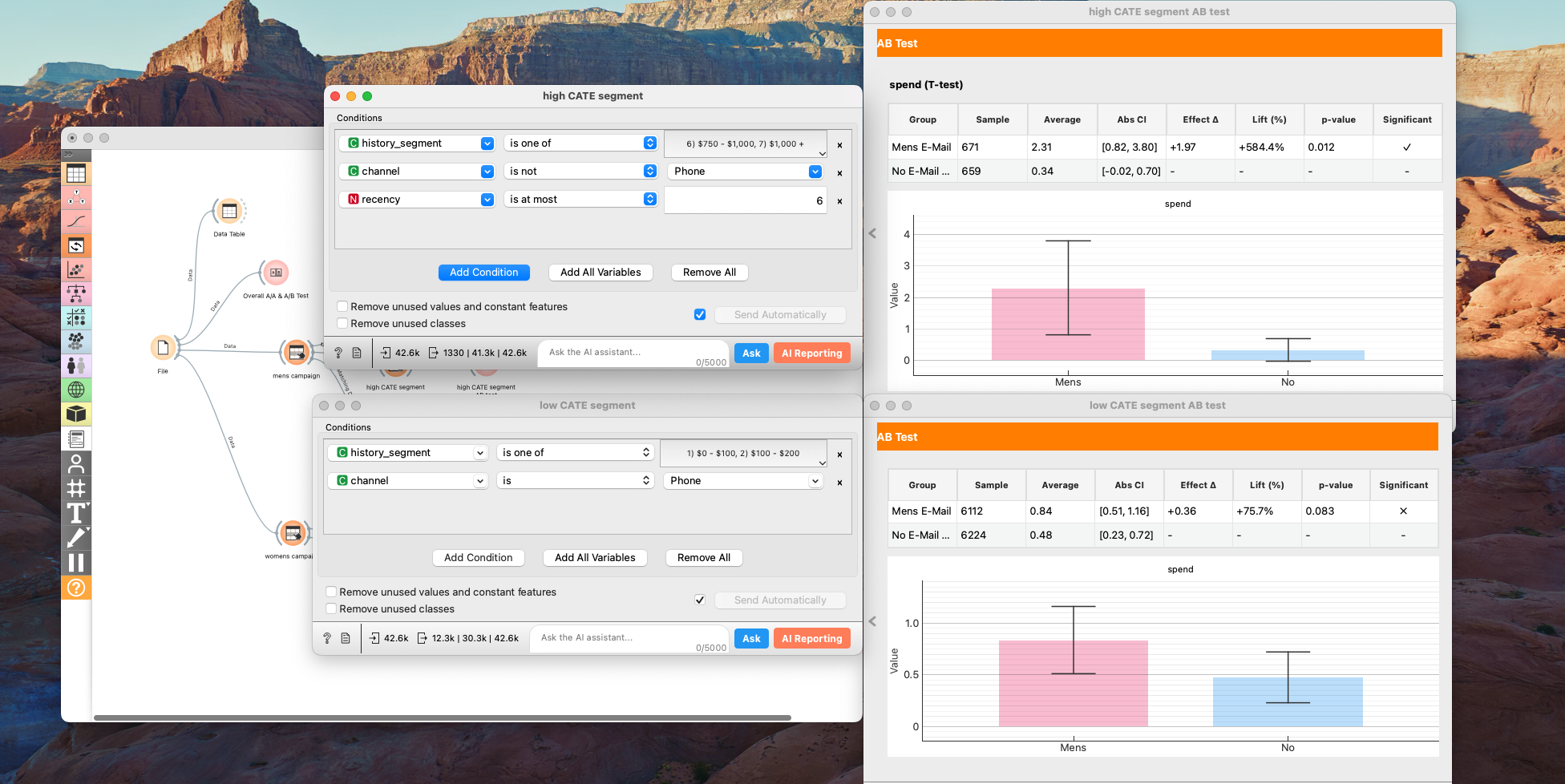
When we isolate this segment and re-run the A/B test, the results are staggering. The lift jumps to +$1.97 (a +584% increase!).
Conversely, "Phone-only" customers with low purchase history show almost no significant lift. This makes intuitive sense: email is a digital channel. Customers who only buy over the phone may simply not engage with digital marketing.
The Womens Campaign: A Warning Sign
The Womens campaign reveals a more complex—and concerning—story.
When we analyze the drivers here, Zip Code pops up as a significant factor. Specifically, customers in Suburban areas reacted differently.
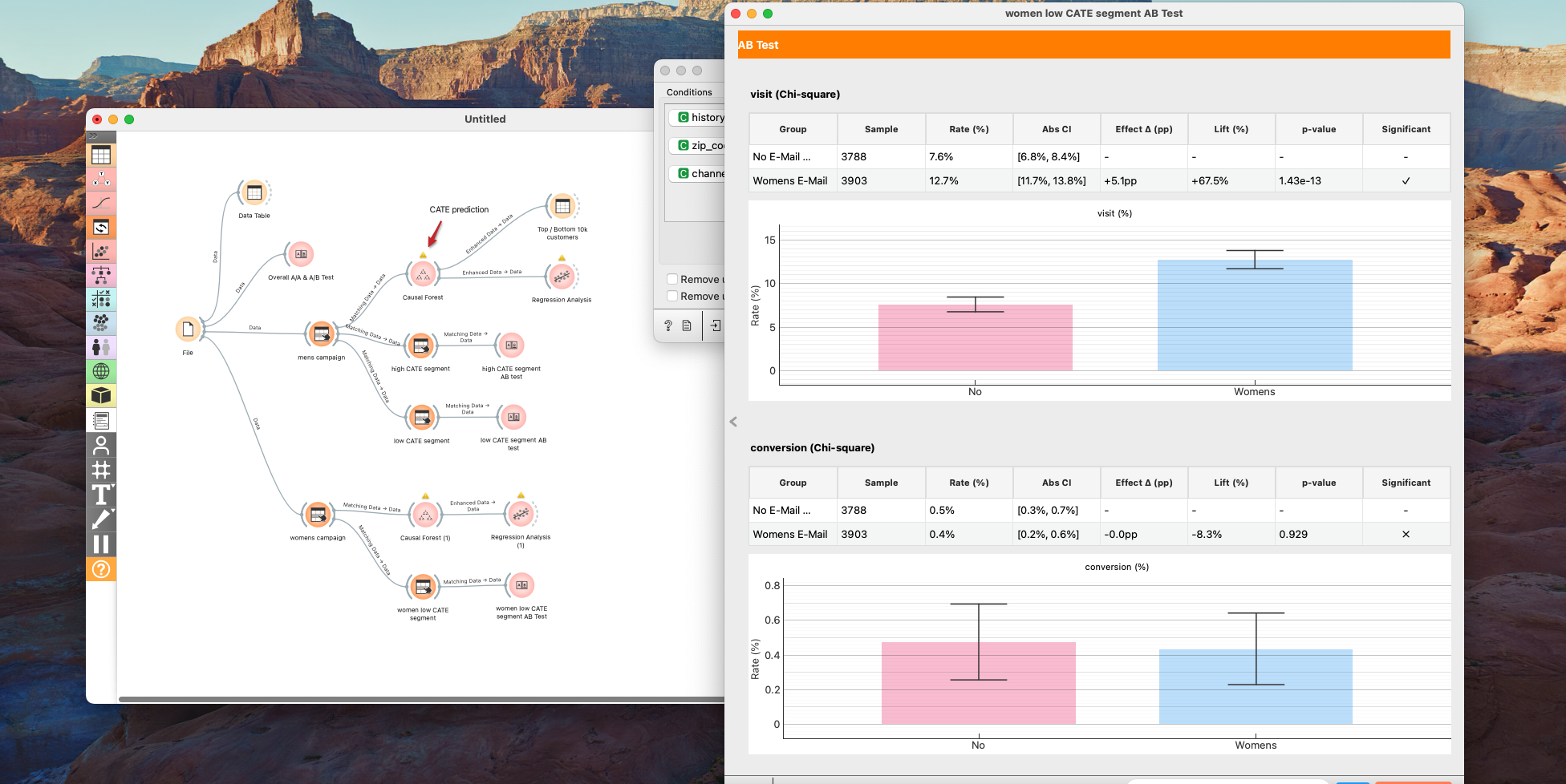
Deep diving into the "low performance" segment (Suburban, Phone channel, Low spend), we find something alarming: The No-Email group actually outspent the Email group.
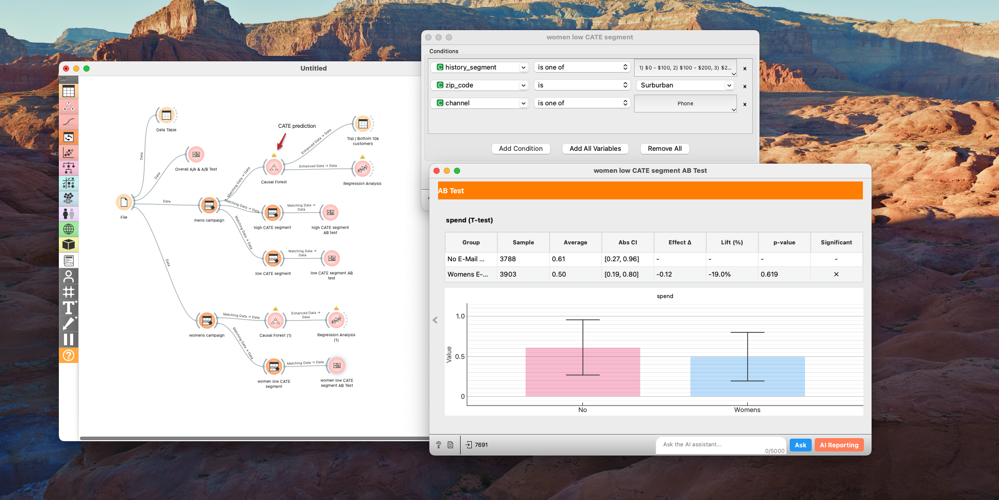
While the p-value (0.619) isn't definitive, the trend is negative (-$0.12). Even more interestingly, visits increased, but conversion didn't. This suggests the email drove traffic, but that traffic converted at a much lower rate than usual.
This could be an important finding that prompts a fundamental review of the company's business strategy. Since sending emails actually led to a decrease in purchase amount for this segment, at the very least, emails should absolutely not be sent to them, and we must further investigate the reasons behind this negative impact. If you were the CEO of this company, you would never simply assume that removing this segment from the campaign solves every problem from the perspective of long-term business growth.
Many hypotheses come to mind. Since they are Phone-only customers, could this be an older demographic less comfortable with aggressive digital marketing?
If I were leading this analysis, my next step would be to investigate the churn rate for this specific segment.
- Is churn increasing? This could signal problems with new product lines, competitors stealing market share, or issues with customer service in those regions.
- Is churn stable but high? Perhaps the brand image has shifted too far towards men's merchandise, alienating this group.
Conclusion
So, to answer the challenge:
-
Which campaign is better? The Mens Campaign is the overall winner.
-
Who should we target? We can use a Causal Forest model to predict CATE for both campaigns and target users with the highest expected lift.
-
Who should we avoid? We must strictly avoid the "Suburban / Phone-only / Low Spend" segment for the Womens campaign, as the email appears to destroy value there.
-
How to Improve?
Based on our findings, here are three concrete ideas for the next iteration:
- Personalize Timing: Since customers who purchased recently showed the higher CATE, we can personalize the timing of the campaign. Triggering emails shortly after a purchase—rather than waiting for a batch campaign—could capture this high engagement window.
- Rethink the Channel: For "Phone-only" users, digital channels like email clearly aren't landing. We should test analog approaches that align with their behavior, such as direct mail (flyers) or phone calls.
- Dig Deeper with Surveys: For the "Suburban / Phone-only / Low Spend" segment where we saw a negative impact, we need to go beyond behavioral data. Conducting surveys to understand their specific dissatisfactions will reveal why the campaign backfired and how to fix the relationship.
By moving beyond simple A/B testing to Causal Inference, we transformed a simple "Winner vs Loser" report into a nuanced strategy that optimizes effect while uncovering deep customer insights and
Data Science Is Fun! Getting It Right Is What Makes It Valuable.
Achieve deeper understanding and higher-quality outputs in data science—beyond your peers. If you want to explore the data yourself, grab the dataset and try reproducing these results in Allye!
You can try Allye Base for free.